It’s no secret that a well-designed landing page can help convert website visitors into customers. But what does a well-designed SaaS landing page look like? And how do you go about building one? If you’re not sure where to start, or if your landing pages could use a little sprucing up, don’t worry!
In this guide, Founderpath will be sharing some expert tips on how to design a SaaS landing page that converts, as well as some great examples of highly effective landing pages in the industry.
Let’s get started!
What is a SaaS landing page?
A SaaS landing page is a page within your website designed with a simple purpose in mind: to sell your product. It’s a page for potential users to “land” on as they try to learn more about the solution you’re providing. It can be part of your main website (e.g., your homepage) or entirely separate.
A great SaaS landing page outlines the problems your product solves, explains how it solves those problems, and summarizes the benefits it offers users.
How your SaaS landing page goes about achieving those goals will depend on a few key factors, including:
- Your Audience: Different users will be looking for different things from your product. You need to design your landing page with a specific user in mind.
- Your Unique Selling Proposition: The things that make your product unique will influence the content and design of your landing page.
- Your Industry: Different industries respond well to different design trends, language, and tones.
- Your Product: The features and benefits of your product will also play a role in determining how you design your landing page.
Now that we’ve gone over what a SaaS landing page is and some of the factors that can influence its design, let’s take a look at some benefits.
What are the benefits of a SaaS landing page?
There are many benefits to using a SaaS landing page to promote your product, including:
Streamlined Sales Funnel
A well-designed landing page can also help streamline your sales funnel, making it easier for potential customers to find what they are looking for and take the next step in the buying process.
Increased Conversion Rate
A SaaS landing page is also important because it can help you increase your conversion rate. By including relevant information and designing your page in a way that is appealing to users, you can increase the chances that they will sign up for your product.
More Visibility and Reach
Additionally, a high-converting landing page can help to build visibility and brand recognition, increasing your chances of success in today’s crowded online landscape.
How much does a SaaS landing page cost?
When it comes to web design, you can spend as much or as little as you’d like. The cost of your SaaS landing page will ultimately depend on your budget and how you go about creating it:
- Template ($0-$200): If you’re on a tight budget, you may want to consider using a template as the starting point for your landing page. Many design platforms and website templates offer free or low-cost options that you can use to create a custom landing page yourself.
- Custom Design ($200-$10,000+): If you have more flexibility in your budget, you may want to consider working with a professional designer or agency. This will usually result in a higher quality design, but will also cost more.
Ultimately, what’s most important is finding the approach that works best for you and your business. Whether that means designing your own landing page or hiring an expert to do it for you, there are many options available to help promote and sell your SaaS product.
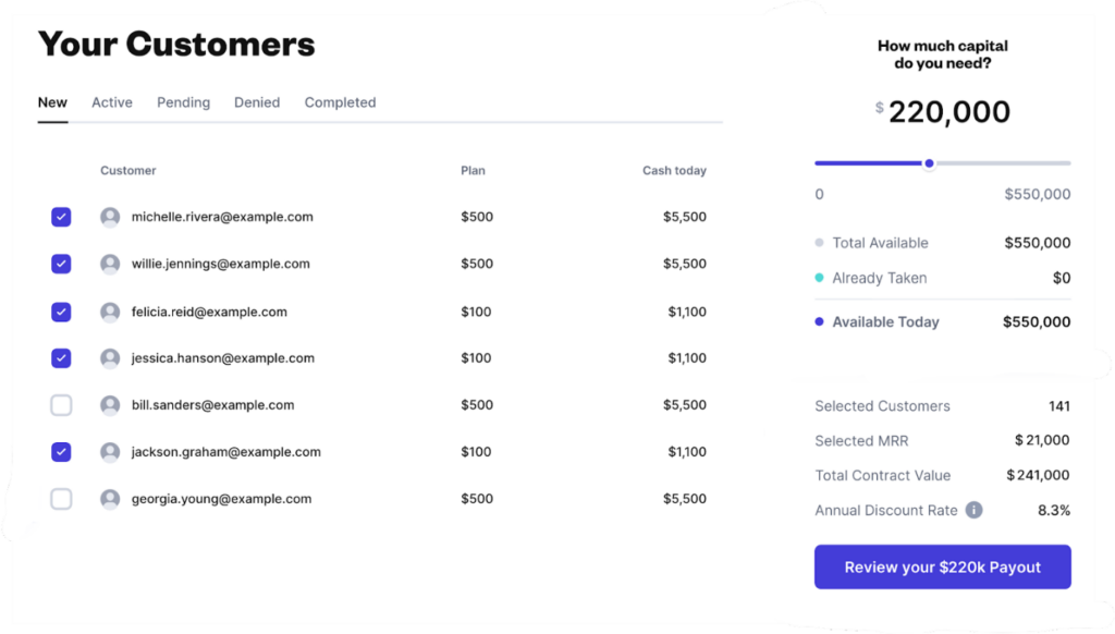
Tip: Need seed funding to build a SaaS landing page that converts? We can help! Founderpath transforms your monthly paying customers into upfront capital in as little as 24 hours—no equity dilution, no credit checks. Click here to see how much you can claim.
SaaS Landing Pages: Best Practices For Design
Before we get specific, let’s take a step back and look at some more general design best practices you should consider when creating your SaaS landing page.
1) Use Whitespace
As the name suggests, Whitespace is the empty space on your landing page. Whitespace is important for two main reasons:
- Whitespace can help make the content more digestible. No one wants to feel overwhelmed by a wall of text!
- Whitespace can help increase conversion rates. It’s easy to use pops of color to make certain elements stand out against a white background.
2) Stick to a Single Column Layout
Multiple column layouts can be confusing for users, so it’s generally best to stick to a single column layout for your landing page. This makes it easier to focus on the most important elements and keep everything organized clearly.
3) Keep Copy Short and Sweet
Your landing page copy should be short, sweet, and to the point. No one wants to read a novel—they want to know what your product does and how it can benefit them.
4) Include Visuals
Visuals are important for helping users understand your product. In addition to product images and videos, you can also use illustrations, graphs, and infographics.
5) Use Directional Cues
Directional cues (such as arrows) can help guide users’ eyes to specific elements of the page, such as your CTA. This is especially helpful if you have a lot of content on your page.
SaaS Landing Pages: Elements To Include
Right off the bat, it’s important to understand that all SaaS landing pages are different. With that being said, there are certain things you’ll want to include if you want to ensure you’re getting the most out of your digital real estate.
Here are eight things your SaaS landing page should include (with examples from ClickUp—a popular SaaS product):
1) A Headline
A headline is the first thing potential users will see when visiting your landing page, so it’s important to make sure it captures their attention. It should distill your sales pitch down to its essence.

ClickUp is an all-in-one productivity tool used to consolidate the features of a ton of other SaaS products, including Slack, Jira, Asana, Notion, Dropbox, and more. Their tagline gets this across in a concise and memorable way.
2) Product Demos
Product images, videos, and demos will help to clarify your offering and provide potential customers with a more tangible understanding of what you’re offering. While photos are fine, studies show that consumers find videos much more compelling.
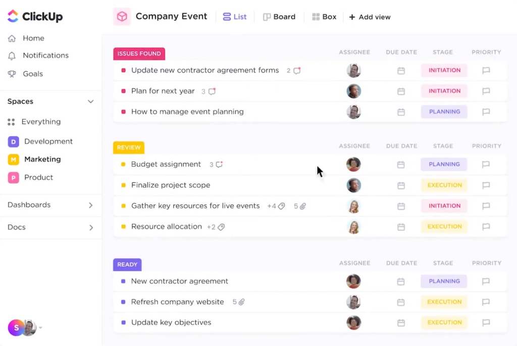
ClickUp uses looped videos to visually demo all the key features of its product without requiring a signup. Visitors are able to get an impression of what it feels like to use the product without actually using it—and that’s powerful!
3) A Call to Action (CTA)
Your landing page should have at least one clear CTA, such as “Sign up now” or “Learn more.” This will help motivate users to take the next step in the buying process.
ClickUp’s CTA isn’t anything special, but it still checks all the boxes, including:
- Actionable Language
- Color Contrast
- Incentives and Benefits
4) Features
Your product’s key features should also be outlined on your SaaS landing page, as this helps to differentiate your offering from other solutions on the market.
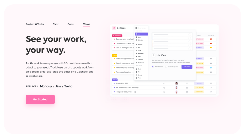
Being a feature-rich app is a huge part of ClickUp’s pitch. To support this, they break down the various aspects of the product into blocks, with each set of features getting its own tab within the block.
This isn’t the only way to show off your product’s features, but it works!
5) Testimonials
Customer testimonials are used to build trust and show users that your product is reliable and effective. Research shows that pages with visible forms of social proof (such as testimonials) are 58% more likely to convert than those without.

ClickUp takes a pretty comprehensive approach to customer testimonials. Visitors can watch a short video of the testimonial being read, read a transcript, flip between different testimonials, and visit the company’s website that supplied it.
6) Client Logos
Your landing page should also proudly display the logos of your most well-known clients as a form of social proof. Here, it’s quality over quantity—ClickUp went with their five most recognizable clients out of a list of 800,000.

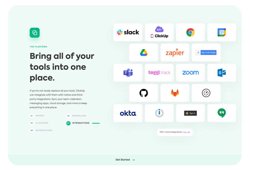
7) Integrations
Finally, if your app integrates with any well-known tools, it’s helpful to display their logos as well. One of ClickUp’s main benefits is the impressive number of integrations, so it makes sense that they’ve made this a key element of their landing page.
Examples of Great SaaS Landing Pages
Now that we’ve gone over some things you should include on your SaaS landing page, let’s look at some examples of great landing pages in action.
Otter.ai
Element in Focus: Testimonials.

Otter.ai is a SaaS product that delivers accurate, real-time note-taking services for businesses, educational institutions, and individuals.
Otter.ai’s landing page does a great job exhibiting all the elements we’ve covered thus far. It’s clean, dynamic, and most importantly, provides an excellent overview of the product’s features and benefits.
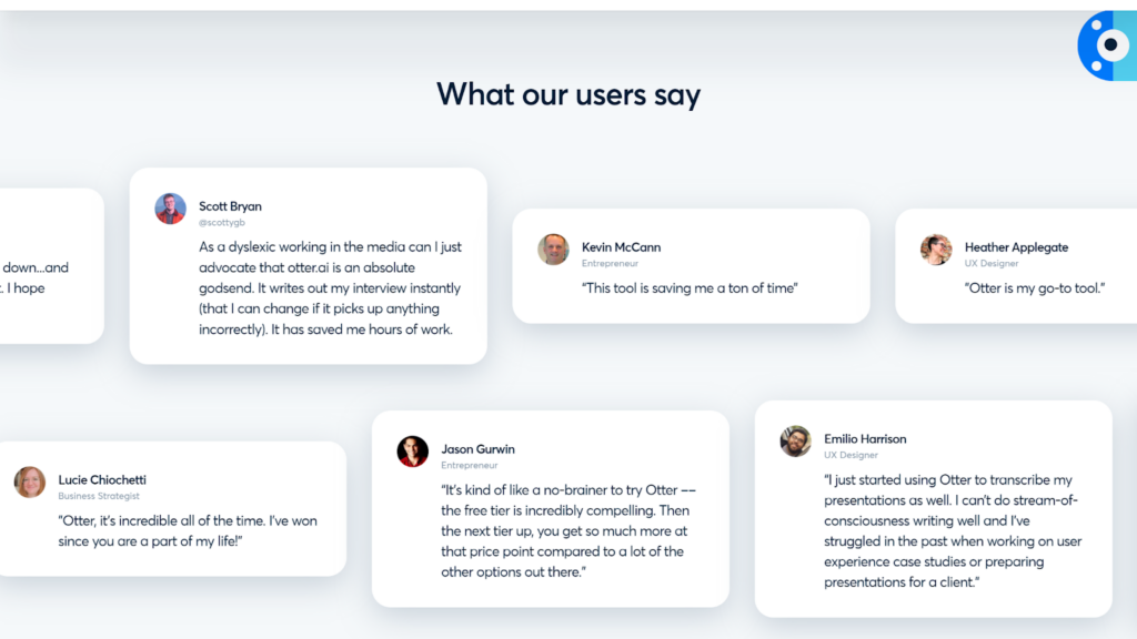
However, we’re especially impressed with how they’ve chosen to include social proof. Customer testimonials flow across the screen at a speed that’s slow enough to read, but fast enough to get their message across: lots of people love this product.
Maze
Element in Focus: Product Demos.
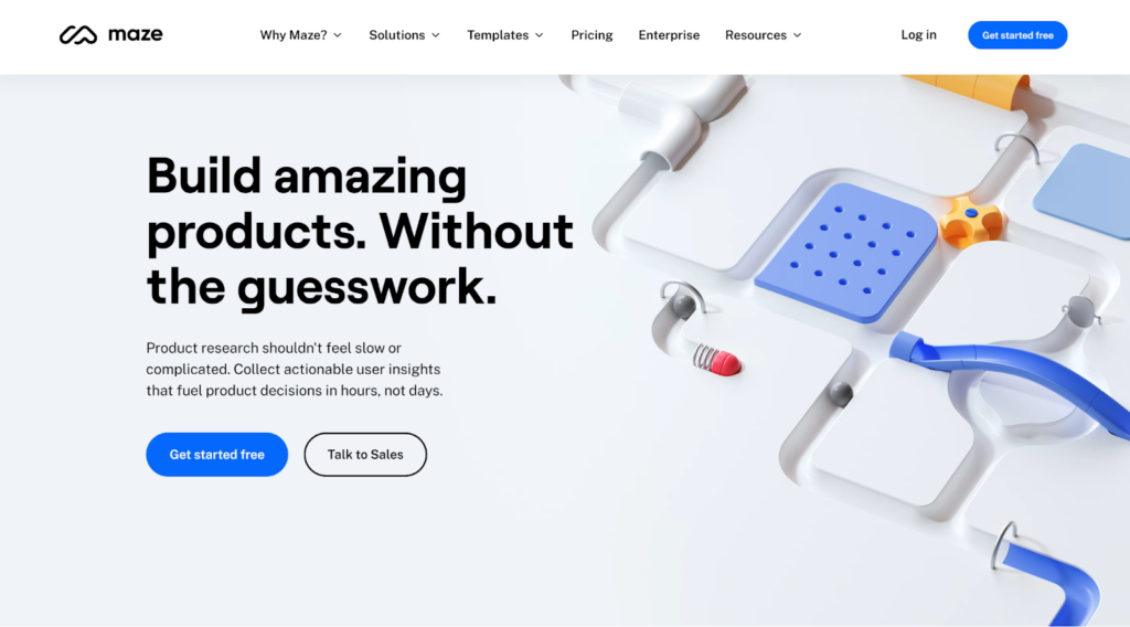
Maze is a market research solution that allows teams to test anything from prototypes to sales copy from wherever they are in the world. The product enables marketers to get rapid, actionable insights that inform their product decisions.
Maze’s landing page is another great example of how to create an effective SaaS landing page. Their front-and-center headline condenses their sales pitch beautifully, and beneath it, we get a simple (but effective) CTA.

However, the element that sets this landing page apart is the product demo. Potential customers are given a complete walkthrough of the testing experience from the perspective of both testers and developers. It’s a simple slideshow, but Maze has included clickable hotboxes to mimic their UX. Plus, when you’re done, you can view a sample report based on the test you’ve just “completed.”
Swingvy
Element in Focus: Features.
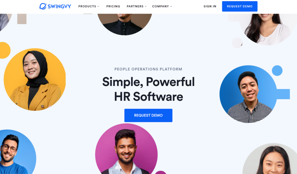
Swingvy is a SaaS platform designed to make life easier for HR professionals by providing an all-in-one tool for all aspects of the job. Their landing page is fairly basic, but it’s effective nonetheless.

Swingvy’s landing page really shines in its feature section. While many SaaS companies choose to spread their features out (e.g., one feature per scroll depth), Swingvy has a single block that lists all the product’s key features.
While that could lead to confusion if poorly executed, the way they’ve designed their feature list block is incredibly simple and elegant. Each feature gets a colored tab, and clicking on a feature brings up a brief explanation and an image that demos it.
Design a SaaS Landing Page That Converts
Creating a great SaaS landing page isn’t easy, but the reward is a virtual asset that converts visitors into paying customers. So don’t wait—start designing your SaaS landing page today!
If you’re in need of funding at any stage in your SaaS start-up journey, Founderpath is here with a founder-focused solution. Rather than giving up equity in your business, turn your monthly recurring revenue (MRR) into upfront capital that you can put towards growing, scaling, and improving your product.


