For SaaS companies, it’s essential to have an appealing website in order to attract customers, and one of the most important aspects is their pricing page. It can make or break sales depending on how it’s designed — everyone wants to feel secure in their purchase, and a pricing page can reassure or discourage customers.
Creating the perfect pricing page requires money — you need the right assets and platform to build your page with. SaaS founders, especially those dealing with startups, can struggle to find the right funding to kick-start their business. Fortunately, platforms like Founderpath exist to give bootstrapped founders the capital they need in a quick and easy manner.
What is a Pricing Page?
A pricing page is basically a web page that showcases your product prices, which usually involve different subscription plans. Customers often turn to price pages for a brief rundown of all your pricing options and features they can unlock. Most sites have a button below each pricing option, which leads customers to the relevant page for making a purchase.
Your pricing page is essential when driving sales — it should be simple and easy to comprehend. Customers should be able to get a clear idea of how much everything costs, what features they get with each plan, and how regularly they must pay for your service. It helps to first set up accounting for your startup so you have all your financial details in order.
How Can a Pricing Page Benefit You?
Branding
A pricing page is a great way to showcase special offers that set you apart from your competitors. You can even draw attention to those offers by adding graphics or highlighting text.
Customers Want Prices
Give customers an efficient way to check out all your pricing plans and available features. A pricing page can display all you have to offer in a simple and concise manner. It can help customers decide whether your service is worth purchasing.
Make Selling Easier
A pricing page saves customers from navigating through multiple pages to learn what features you offer and how your pricing works. Instead, you can give them all the details they’ll need in order to make an informed purchase..
Things to Consider When Setting Up a Pricing Page
Simplify the Design
A pricing page must be visually appealing and easy to navigate, which means you should keep the design simple. Customers should be able to glance at the page and immediately find what they’re looking for.
Information
Make sure your pricing information is accurate and written concisely. For example, any listed features should only be a few words long to avoid large sections of text. Try to keep the information brief to prevent customers from feeling overwhelmed.
Limit Your Pricing Plans to a Few Options
Don’t include too many pricing plans on your pricing page — keep it to around 3 if possible. Too many options can clutter up the page or overwhelm customers. The fewer plans there are, the easier it is for customers to decide on a purchase.
Best Pricing Page Examples
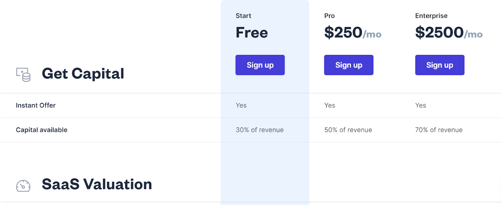
#1: Founderpath
Founderpath’s pricing page has a simple layout and a fairly short list of features, which makes the page uncluttered and easy to navigate. The page chooses to highlight the free plan by using a different color and discussing it in its banner.
Pros
- There are only three pricing plans, so customers are unlikely to get overwhelmed.
- The pricing plans are displayed in different columns to make them easy to view.
- The prices are in a bigger font, so customers can quickly find them.
- The features are organized under different headings, which are also in a bigger font, so customers can just skim the page to get a good idea of what Founderpath offers under each plan.
- There are buttons for each pricing plan, making it easier for customers to sign up and purchase.
- The free plan is highlighted in a different color to let customers know immediately that they don’t need money to use the service.
Cons
- There are no collapsable menus, so customers have to scroll the page to view all the features’ headings.
- There are no discounts or special offers displayed to entice customers.
- There are just blanks next to features that are unavailable, which are hard to notice at first glance.
#2: Box
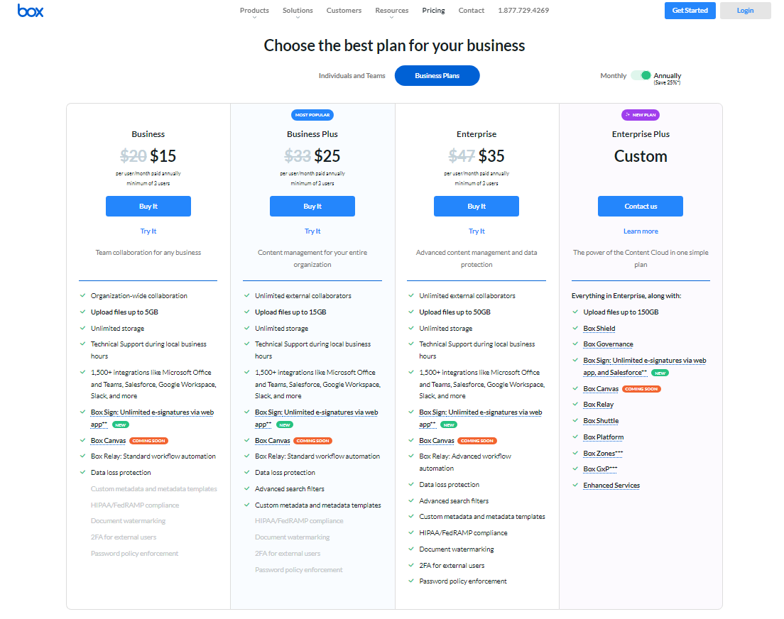
Box’s pricing page has two different displays — one for individuals/teams and one for businesses. You can navigate between them by clicking the tabs near the top of the page. There’s also a tab for switching between monthly and annual plans. They choose to highlight their most popular plan, as well as their newest plan.
Pros
- The pricing plans are separated into columns for simple viewing.
- There are discounted prices for each annual plan to highlight how much money customers can save.
- They label their most popular plan to make it easier for customers to choose one.
- There are interactive buttons for each plan.
- There’s a ‘try it’ option for each plan to inform customers about their free trials.
- Certain features are highlighted in bold to draw attention to them.
- There’s a collapsable menu to reduce clutter.
- Customers can hover over underlined features to view a small pop-up, which explains what the feature entails.
Cons
- Features aren’t separated into different categories, which makes the page seem cluttered.
- The business pricing page has two different sections, which can feel overwhelming.
- There are over 5 plans available in total, which makes choosing one difficult for customers.
- One of the plans is showcased on both the individual pricing page and the business pricing page, which can be confusing.
#3: Mailchimp
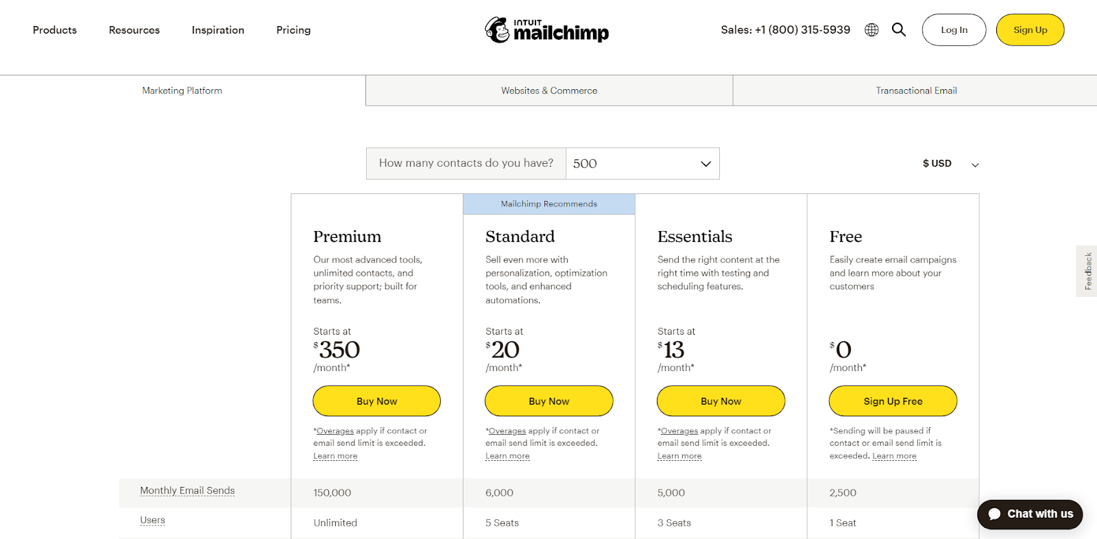
Mailchimp’s pricing page has three different displays: one for marketing, one for website and commerce, and one for transactional emails. Only the first two have subscription plans so we’ll be focusing on them. Mailchimp has one recommended plan, which they highlight using a label.
Pros
- The buttons are made to stand out since they’re in a bright yellow color, which contrasts with the white background.
- The banner showcasing the different prices stays visible even as you scroll down the page, making it easy to keep track of which columns you’re looking at.
- Not all features are on display to avoid overwhelming customers.
- The buttons pop up when you hover over them, which is visually interesting.
- There’s an option to change currencies, which allows customers across the globe to get an accurate idea of their pricing.
- Customers can change the number of contacts and view the right prices for their business.
- There’s a FAQ section so customers can easily resolve their queries.
Cons
- Customers have to go to another page to view all features — there’s no collapsable menu.
- The features aren’t organized into different categories.
- There are a lot of pricing plans, which can be overwhelming.
- There’s a lot of information on the pricing page.
- The banner showcasing the different prices remains visible even when you scroll past the features section, which is obstructive to customers navigating the FAQs.
#4: Google Workspace
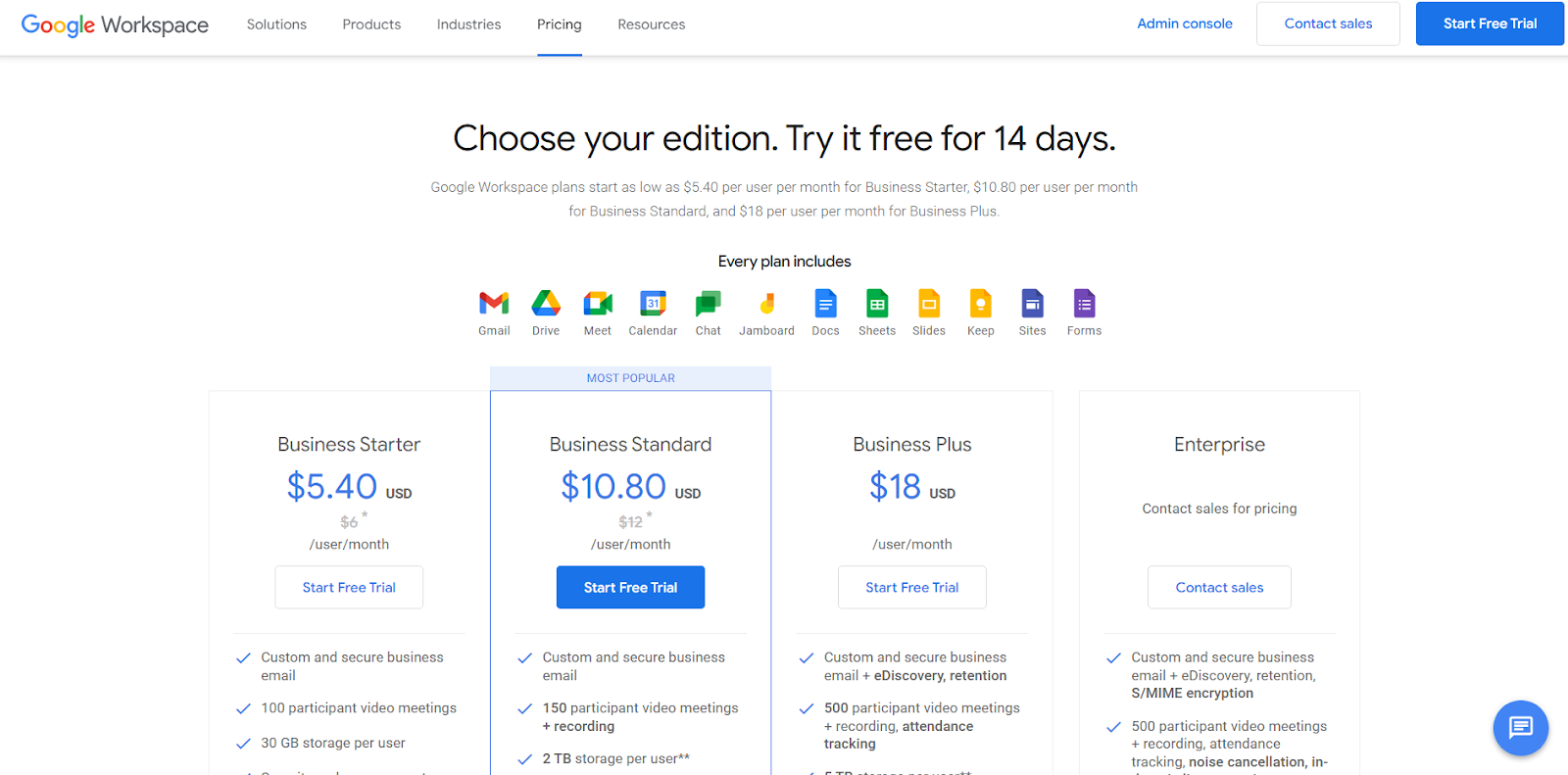
Google Workspace’s pricing page highlights their free trial by discussing it near the top of the page. They also emphasize their most popular plan by outlining it. The page has two sections — the first displays their prices and key features, while the second provides more detail on all the features available within the tool.
Pros
- There’s a collapsable menu.
- Some words are in bold to emphasize them.
- The buttons are labeled ‘start free trial’ to clearly indicate where they’ll lead.
- Features are separated into categories.
- The pricing banner remains visible as you scroll through the features.
- There’s a small FAQ section to prevent too much clutter.
Cons
- Some features are quite lengthy in name, which makes certain parts of the page seem cluttered.
- Some of the buttons aren’t colored, which makes them harder to notice.
- There are a lot of features listed, which can intimidate customers.
- The collapsable menu option is very small and hard to notice at first glance.
#5: Deel
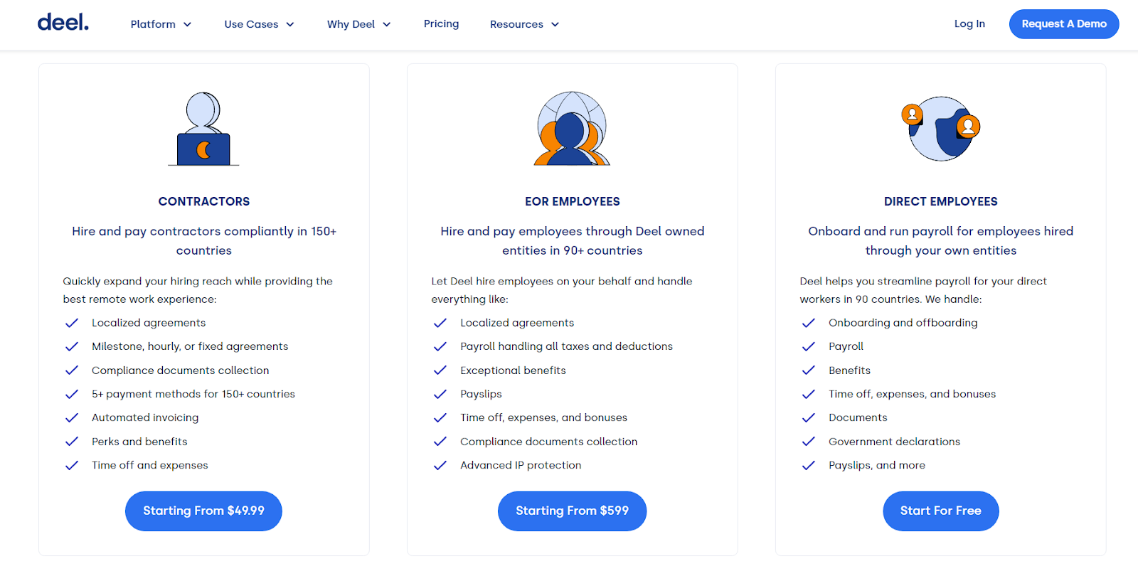
Deel’s pricing page is very simple — only key features are listed in order to keep the information brief. They emphasize their free demo by including multiple ‘get started for free’ buttons. Their pricing page also has a comparison section, where they list reasons why customers should choose them over their competitors.
Pros
- The pricing information is short and concise.
- There are interactive buttons for each pricing plan.
- The list of features is brief and easy to skim.
- There are buttons that lead customers to their free demo.
- The comparison section shows what sets them apart from competitors, which can encourage customers to make a purchase.
- A link to their demo is always visible as you scroll the page as a constant reminder to customers.
Cons
- There are multiple sections, which makes the pricing page quite long.
- Customers aren’t told whether they offer monthly subscriptions or annual ones.
- The ‘starting from’ buttons under each pricing plan make the price seem vague, which can discourage customers.
Conclusion
Pricing pages are essential to driving more sales for your business — customers often use these pages to determine whether you’re worth their money, so having a well-designed pricing page is key. Many SaaS businesses opt for a simplistic design to appeal to customers — the easier it is to navigate, the better.
Creating the perfect pricing page on your website usually requires money, which many SaaS founders can lack — especially during the startup stage. Founderpath is here to help bootstrapped SaaS founders receive the capital they need to get their businesses off the ground. Try Founderpath for free today to start funding your business.


